

About the
project
Date
12 december 2024
Client
Keoki Galeiai
Category
Branding, Redesign
Tags
Design
Share
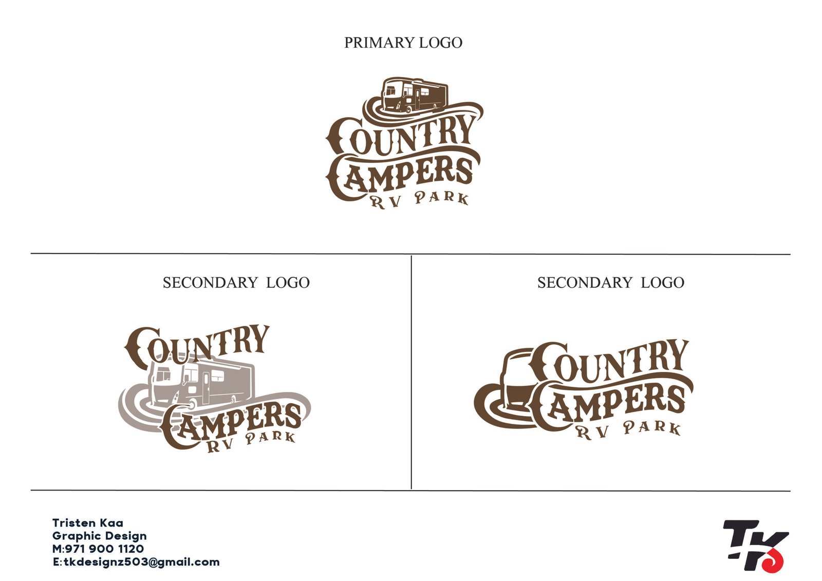
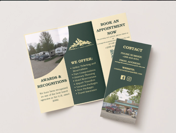
Country cORNERS RV PARK
The Problem
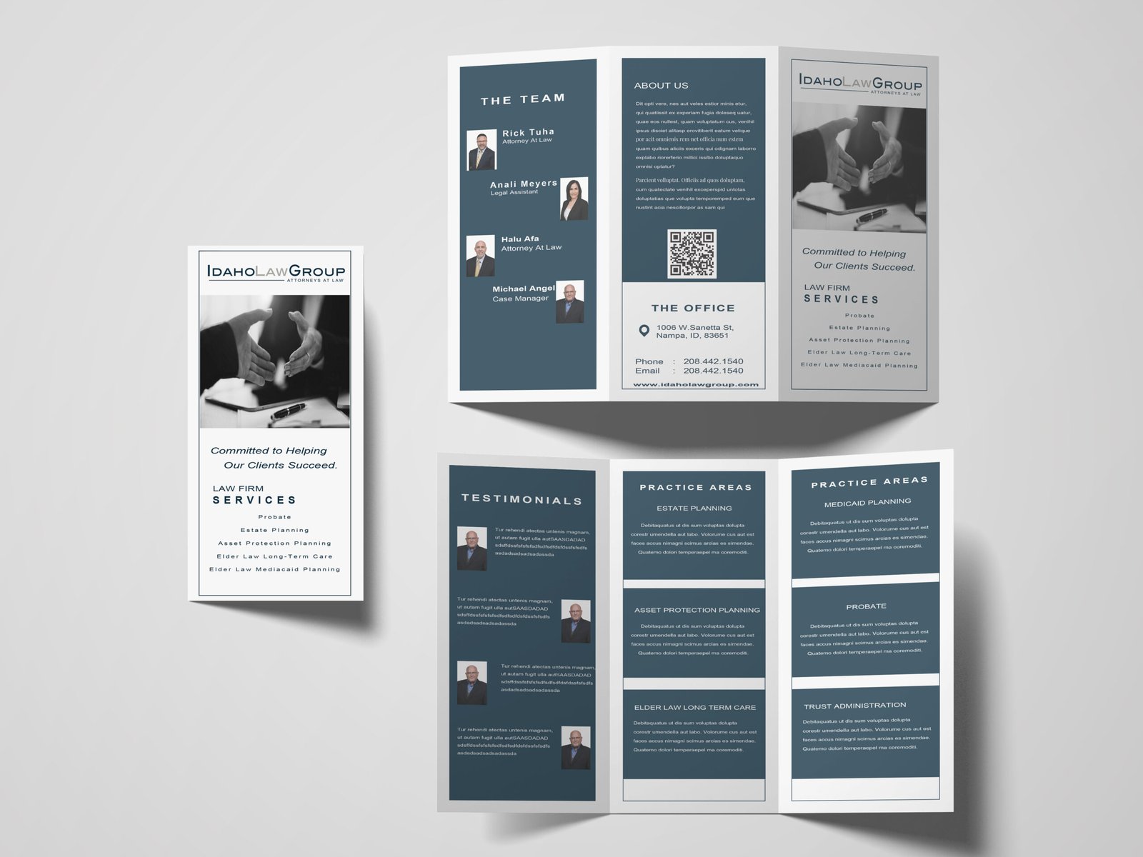
The law firm’s original branding felt outdated and unprofessional. The logo was pixelated and lacked visual impact, while the black-and-white color palette didn’t reflect the firm’s desired tone. The website was also cluttered and not user-friendly, with poor image quality and a layout that didn’t support easy navigation — especially for an older audience. While the brand was already known, it needed a refreshed look that preserved recognition but improved clarity and presentation.
My Approach
After meeting with the client, we learned that he was open to changes but preferred to keep the original logo recognizable. We refined the logo by using a bolder font, improved spacing, and high-resolution formatting to eliminate pixelation. For the website, we researched top-performing legal sites and created a cleaner, more minimal layout with updated images, reorganized content, and a more subtle tone tailored to older users. The updated brand direction was presented internally, and the website redesign was developed in partnership with another developer over a two-month timeline.
The Result
The rebrand resulted in a clearer, more professional logo and a user-friendly website that better represented the firm’s identity. The updates maintained brand familiarity while enhancing visual appeal and usability. Since launch, the site has improved user experience and boosted brand perception, giving the firm a more credible and polished digital presence. The rebranding has brought greater awareness to the company and better aligned its look with its values and audience.

We create digital ideas that are bigger, broader, braver and better.
Lorem ipsum is simply dummy text of the printing and typesetting industry. lorem ipsum has been the industry’s
standard dummy text ever since when an unknown printer took a galley of type and scrambled it to make a type
It has survived not only five centuries, but also leap into in the 1960s with the release.

Lets Talk
Address List
-
1720 North Raymond Street
Boise
Idaho, 83702 - +971 900 1120
- tkaa774@hotmail.com
Social Networks
- TristenKaa
- insta_account
- www.linkedin/tristen-kaa

Helping businesses create intuitive, high-converting websites.