
Ut elit tellus, luctus nec ullamcorper mattis.


idaho law group
The Problem
The law firm’s original branding felt outdated and lacked professionalism. Its pixelated logo and stark black-and-white palette failed to convey the firm’s tone. The cluttered, hard-to-navigate website further hindered user experience, especially for older visitors. The brand needed a refreshed look that maintained recognition while improving clarity and usability.
Goal
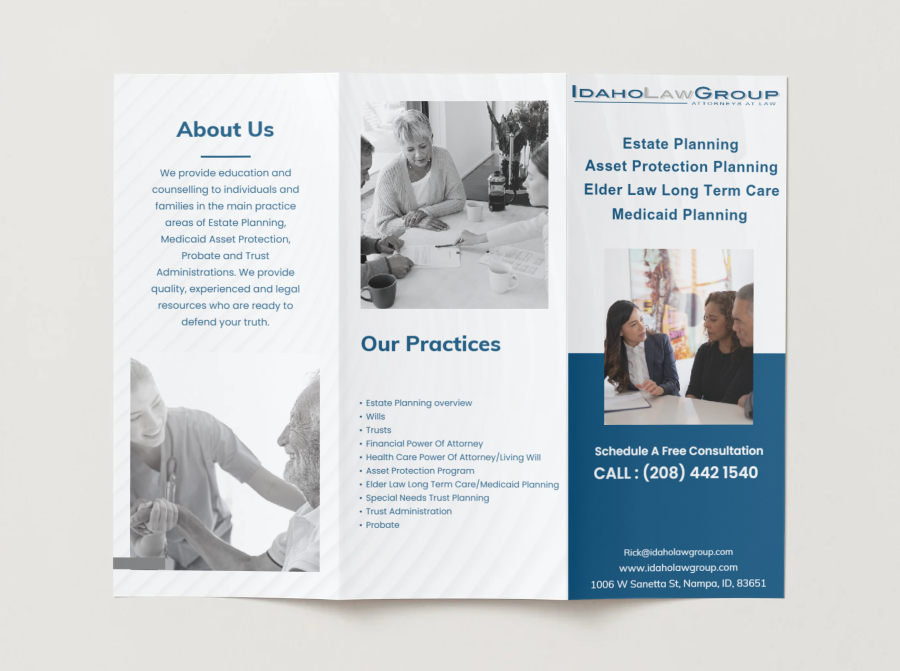
The client wanted a refreshed brand while keeping the logo recognizable. We refined the logo with a bolder font, improved spacing, and high-resolution formatting. For the website, we designed a cleaner, more minimal layout with better images and reorganized content, tailored to an older audience. The redesign was developed over two months in collaboration with another developer.
Your Solution
The rebrand delivered a clearer, more professional logo and a user-friendly website that maintained brand familiarity while improving visual appeal. Since launch, the firm has seen improved user experience, stronger brand perception, and a more credible digital presence aligned with its values and audience.
Results
The rebrand delivered a clearer, more professional logo and a user-friendly website that maintained brand familiarity while improving visual appeal. Since launch, the firm has seen improved user experience, stronger brand perception, and a more credible digital presence aligned with its values and audience.
Logo concepts and redesign
Exploring New Concept Ideas
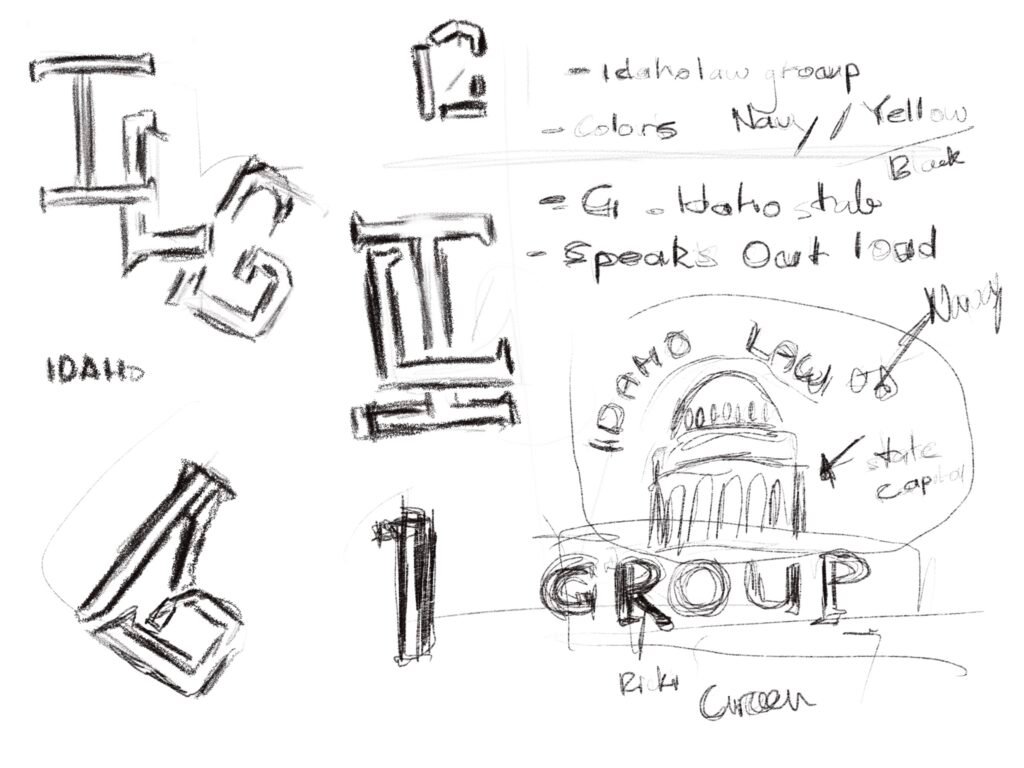
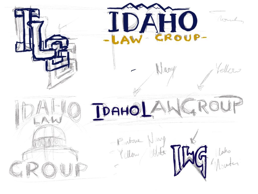


I created logo variations incorporating Idaho’s state and capital to explore brand identity. Researching law logos online, I noticed they favor simple designs with Roman or Sans Serif fonts. I also looked at local Idaho logos, often using green shades. These ideas were presented to the client for and got feedback. The client wanted to see what I can come up with. And explore options. Leaning towards still the original logo he has and refining it.
Refining companies original Logo
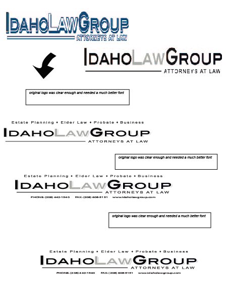
The Customer decided to stick with the original design. wanted to go back to refine it, make the visual of it stand out more. With communication and spacing and shifting things around we were able to refine the logo and come up with a font and being able to find direction.
Final Original Logo

The final logo was shaped with direct client input—clean, professional, and clearly defined. Core services were added beneath to enhance clarity and reinforce the firm’s purpose.
Style guide and fonts

Lorem ipsum dolor sit amet, consectetur adipiscing elit. Ut elit tellus, luctus nec ullamcorper mattis, pulvinar dapibus leo.
Lorem ipsum dolor sit amet, consectetur adipiscing elit. Ut elit tellus, luctus nec ullamcorper mattis, pulvinar dapibus leo.
Collatral

Explored visual concepts logo variations, of sketches incoporating the idaho state and also capital to see what visual indentyt and appearance it brings to the brand.
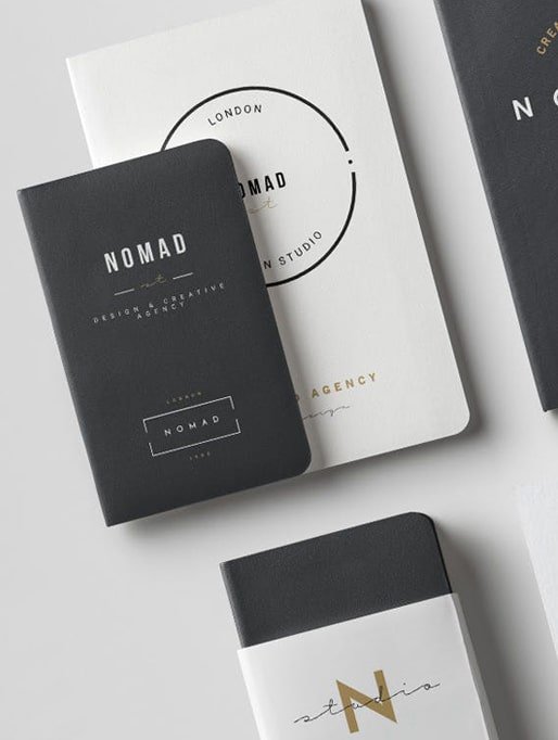
Look into different typography for the font for the design concepts
Lorem ipsum dolor sit amet, consectetur adipiscing elit. Ut elit tellus, luctus nec ullamcorper mattis, pulvinar dapibus leo.
Style Guide
Explored visual concepts logo variations, of sketches incoporating the idaho state and also capital to see what visual indentyt and appearance it brings to the brand.
Look into different typography for the font for the design concepts
Lorem ipsum dolor sit amet, consectetur adipiscing elit. Ut elit tellus, luctus nec ullamcorper mattis, pulvinar dapibus leo.
Results
Lorem ipsum dolor sit amet, consectetur adipiscing elit. Ut elit tellus, luctus nec ullamcorper mattis, pulvinar dapibus leo.
Lorem ipsum dolor sit amet, consectetur adipiscing elit, sed do eiusmod tempor incididunt ut labore et dolore magna aliqua. Quis ipsum suspendisse ultrices gravida. Risus commodo viverra maecenas accumsan lacus vel facilisis.

Joseph L.Mabie
Influencer
Contact
Address List
-
1720 North Raymond Street
Boise
Idaho, 83702 - +971 900 1120
- tkaa774@hotmail.com
Social Networks
- TristenKaa
- insta_account
- www.linkedin/tristen-kaa

Helping businesses create intuitive, high-converting websites.