Recent Projects
Terachaserealitor
Project Title: WordPress Designer & UI/UX Developer
Scope: UI/UX Design – WordPress Development – Website Redesign – UI Testing – Content Management – Client Collaboration
Client/Context: Tera Chase Realitor – Real Estate Website Ongoing WordPress Website Project
Problem Overview: This project involved designing and building a custom WordPress website from scratch for a real estate professional. The goal was to create a clean, modern, and easy-to-navigate site that showcased property listings, strengthened brand credibility, and provided a smooth user experience for buyers and sellers.The website was designed to align visually and functionally with an established real estate site for inspiration, while still maintaining a unique brand identity tailored to the client.
The Challenge: No fully developed website structure at the start of the project, Needed a professional, real-estate-focused UI that built trust and usability, Required ongoing updates for new listings and content, Had to balance design, usability, and scalability as the project continues to evolve
My Role: Designed and built the website entirely from the ground up using WordPress, Sketched initial wireframes by hand to plan layout, hierarchy, and user flow, Conducted discovery sessions and collaboration meetings with the client to align business goals, branding, and user needs, Performed UI testing to improve navigation, layout consistency, readability, and mobile responsiveness, Designed page layouts optimized for real estate listings, calls-to-action, and user engagement.
Result: The website has been successfully presented to the client and real estate team and is currently live and actively evolving. The client has expressed strong satisfaction with the direction of the design and has requested continued collaboration for future updates and expanded listings. This ongoing project has strengthened my experience in real estate web design, UI testing, WordPress development, and long-term site management, while allowing me to grow my understanding of the real estate industry.
Project Title: WordPress Designer & UI/UX Developer
Scope: UI/UX Design – WordPress Website Redesign – Branding – Logo Design – Navigation Optimization – Accessibility & Usability
Client/Context: Brand Design – Website Rebuild – Recreation – Outdoor Park Website
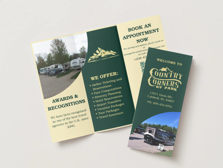
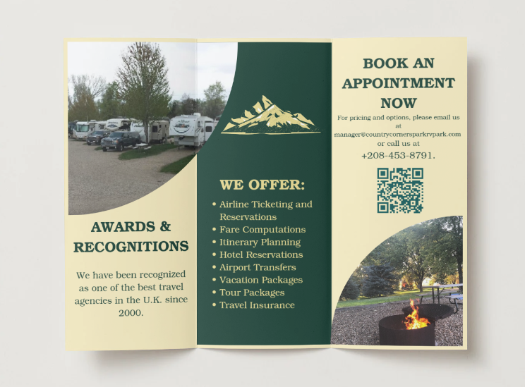
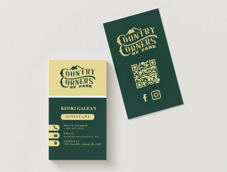
Problem Statement: This project focused on a complete website redesign and brand refresh for an outdoor park serving primarily retirees aged 50–60. The existing website suffered from outdated visuals, cluttered layouts, and poor usability, which made it difficult for visitors to find important information and complete key actions such as camp sign-ups. The goal was to modernize the brand while creating a calm, welcoming, and easy-to-navigate digital experience that aligned with the park’s natural Idaho setting.
The Challenge: Outdated website design and inconsistent branding, Overloaded content and overwhelming navigation, Poor color choices and imagery that weakened brand identity, Critical forms and links were difficult to locate and use.
My Role: Designed a modern, nature-inspired logo reflecting the Idaho countryside and relaxed atmosphere of the park, Selected a grounded, earthy color palette (including light khaki browns and natural tones) to create a calm, welcoming experience, Rebuilt the website in WordPress, focusing on clarity, readability, and intuitive navigation, Reorganized site content to reduce clutter and improve information hierarchy, Ensured key actions and camp sign-up forms were easy to locate, fully functional, and accessible, Applied UI best practices to support an older user demographic, prioritizing simplicity and ease of use
Result: The client and internal team responded very positively to the redesign, particularly praising the clean navigation, improved usability, and calming visual design. The new website strengthened the brand’s identity and made it significantly easier for visitors to explore the site and complete important actions..
Project Title: WordPress Designer & E-Commerce Developer
Scope: Logo Design – Branding – Menu Design – Website Design
Client/Context: Redesign website, Branding, Law firm,
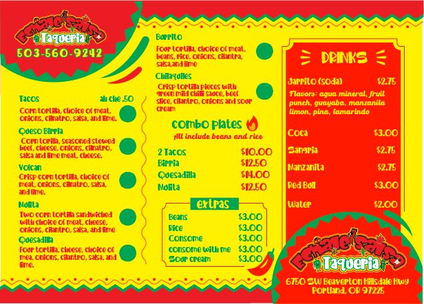
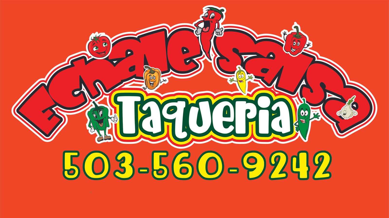
Problem Overview: Echalesalsa is a food truck that needed a complete visual identity from the ground up. With no existing logo or branding, it was difficult for the business to stand out—especially online. The goal was to create a playful, cartoon-style brand that reflected the bold flavors, fresh ingredients, and fun personality of the food, while also building a website that seamlessly connected customers to DoorDash for ordering.
The Challenge: No existing logo or brand identity, Needed a distinctive, eye catching tyle to stand out in a competitive food truck market, Required a smooth online ordering experience through DoorDash Integration.
My Role: I developed a vibrant, cartoon-style logo that captured the energetic personality of the brand and highlighted the freshness of its ingredients. Building on that visual language, I designed cohesive branding elements and a user-friendly website. The site was structured to integrate smoothly with DoorDash, allowing customers to place orders easily while maintaining a fun and engaging brand experience.
Result:The client was extremely happy with the final branding and website. The bold colors and playful design aligned perfectly with their vision and helped establish a strong, recognizable identity. The new website enhanced their online presence and made ordering more accessible, supporting both brand visibility and customer engagement.


Project Title: WordPress Designer & UI/UX Developer
Scope: UI/UX Design – WordPress Website Redesign – Color Palette Development – Branding – Navigation Optimization
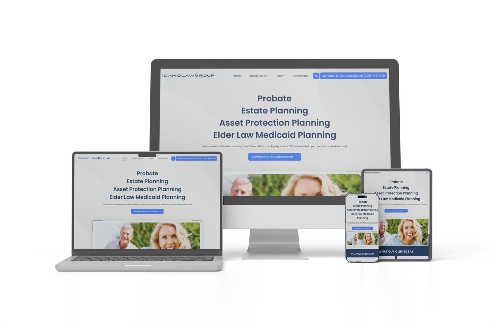
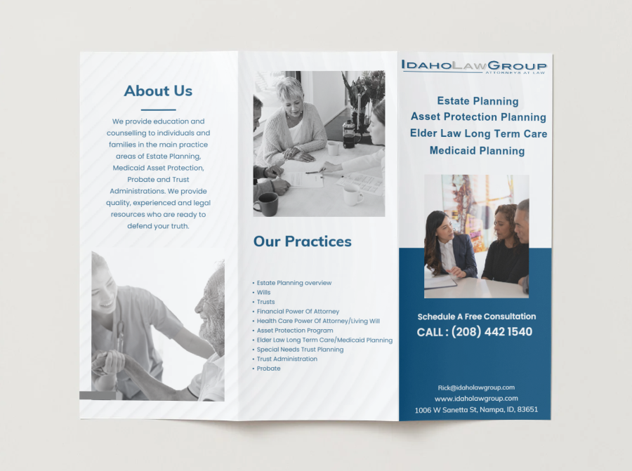
Client/Context: Law Firm Website Redesign – Idaho Law Group Brand Website Design in collaboration with WordPress Developer.
Problem Statement: This project involved designing a professional, modern WordPress website for a law firm. The existing site was outdated, lacked a cohesive brand identity, and did not reflect the credibility and professionalism of the firm. The goal was to create a clean, approachable, and trustworthy online presence, with clear navigation, a consistent color palette, and a modern visual identity that would resonate with clients seeking legal services.
The Challenge: Existing website was outdated, visually inconsistent, and lacked a clear brand identity, Navigation was cluttered, making it difficult for potential clients to find key information, Branding colors, typography, and imagery were not aligned with the firm’s professional image, The project required collaboration with another developer to integrate design updates into WordPress
My Role: Developed a modern, professional color palette and visual style to reinforce the firm’s credibility, Designed page layouts, typography, and imagery to improve readability and user engagement, Collaborated with the WordPress developer to implement the design and ensure seamless integration, Optimized navigation and content layout to make important information easy to access for clients, Applied UI/UX best practices to create a clean, approachable, and user-friendly experience
Result: The redesigned website successfully communicated a professional, trustworthy brand identity, with a modern, polished appearance. Clients and the law firm team praised the improved navigation, cohesive branding, and clean visual design. The new website strengthened the firm’s online presence and provided a more intuitive experience for potential clients seeking legal services.
Idaho Law Group

Lets Talk About Your Project
Address List
-
1720 North Raymond Street
Boise
Idaho, 83702 - +971 900 1120
- tkaa774@hotmail.com
Social Networks
- TristenKaa
- insta_account
- www.linkedin/tristen-kaa
Helping businesses create intuitive, high-converting websites.
